About
Client: Crab
Sector: Insurance Broker
Country: Belgium
Founded over one hundred years ago, Crab is an independent insurance broker company based in Brussels.
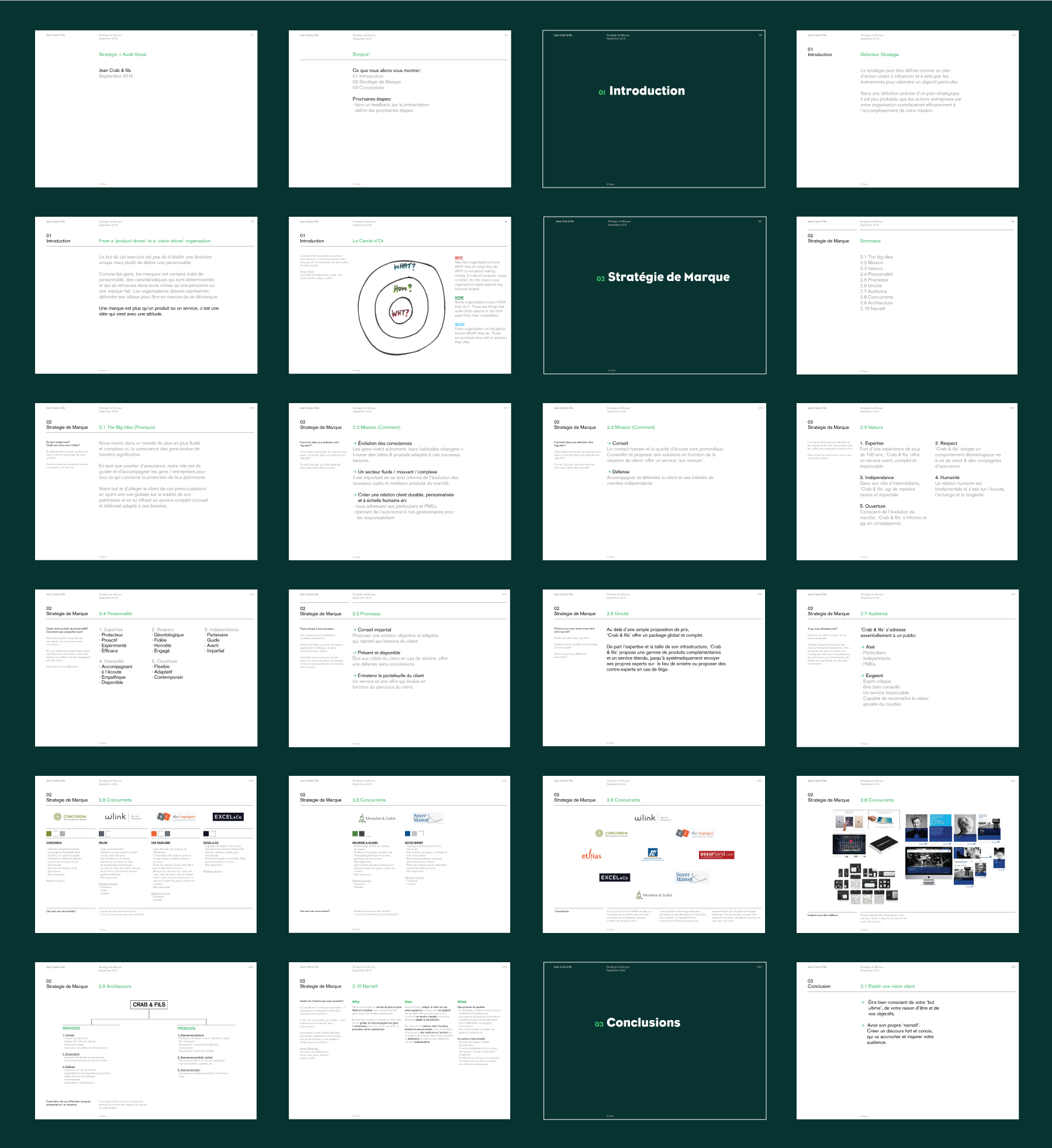
Strategy
Even if they constitute our basic protection in our lives, insurance matters aren't the most exciting thing to deal with, especially for younger generations.
Despite its great reputation and an up to date portfolio of insurance products, Crab (previously named 'Jean Crab & ses fils') has to cope with an ageing clientèle.
The aim of this project was to redefine the company's personality in order to make their profession more accessible and appealing to the younger générations.
Identity
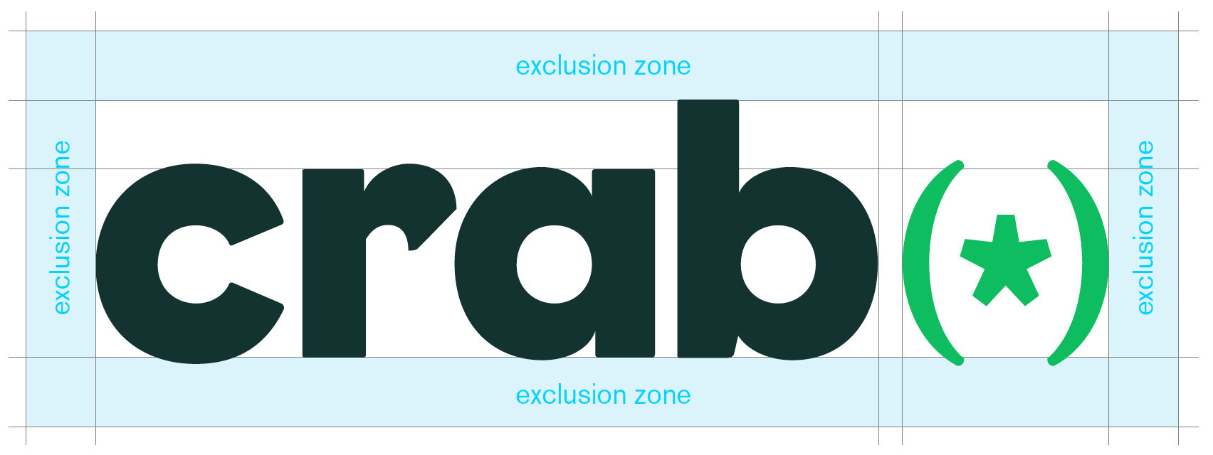
The solution was to create a simple but very recognisable wordmark. We began by shortening their name from 'Jean Crab et ses fils' to 'Crab'. We opted for an unconventional yet legible typeface.
The name 'Crab' is followed by an asterisk between brackets. The asterisk stands for the protected individual/good whilst the brackets symbolises the protection. On that basis we developed a system where the asterisk could be replaced by a word or a message.
The colour green conveys trust, calm and expertise. The colour choice also acts as a differentiator as it is rarely used within the insurance sector.
Implementations
· Strategy
· Naming
· Identity


