About
Client: La Falize
Sector: Food and drinks
Type: Organic Farm
Country: Belgium
Project
Domaine La Falize is a family estate that has been preserved for many generations. Their aim is to restore the agricultural process. Convinced of the need to change its paradigm, they believe that it plays a key role in reducing the C02 emissions and protecting biodiversity.
With the advent of intensive agriculture, people tend to forget agronomy is an ancient craft, where men (farmers, alchemists, sorcerers and healers) used to collaborate closely with nature. By observing it’s secret combinations and replicating its subtle influences, they where able to sublimate the benefits of nature and reap its best fruits from it.
The requirement for taste and excellence lies at the heart of La Falize’s approach. Their purpose is to create exceptional products and food by proceeding completely vertically, from seed to plate and from vine to bottle, with the greatest respect for nature and their products.
Idea
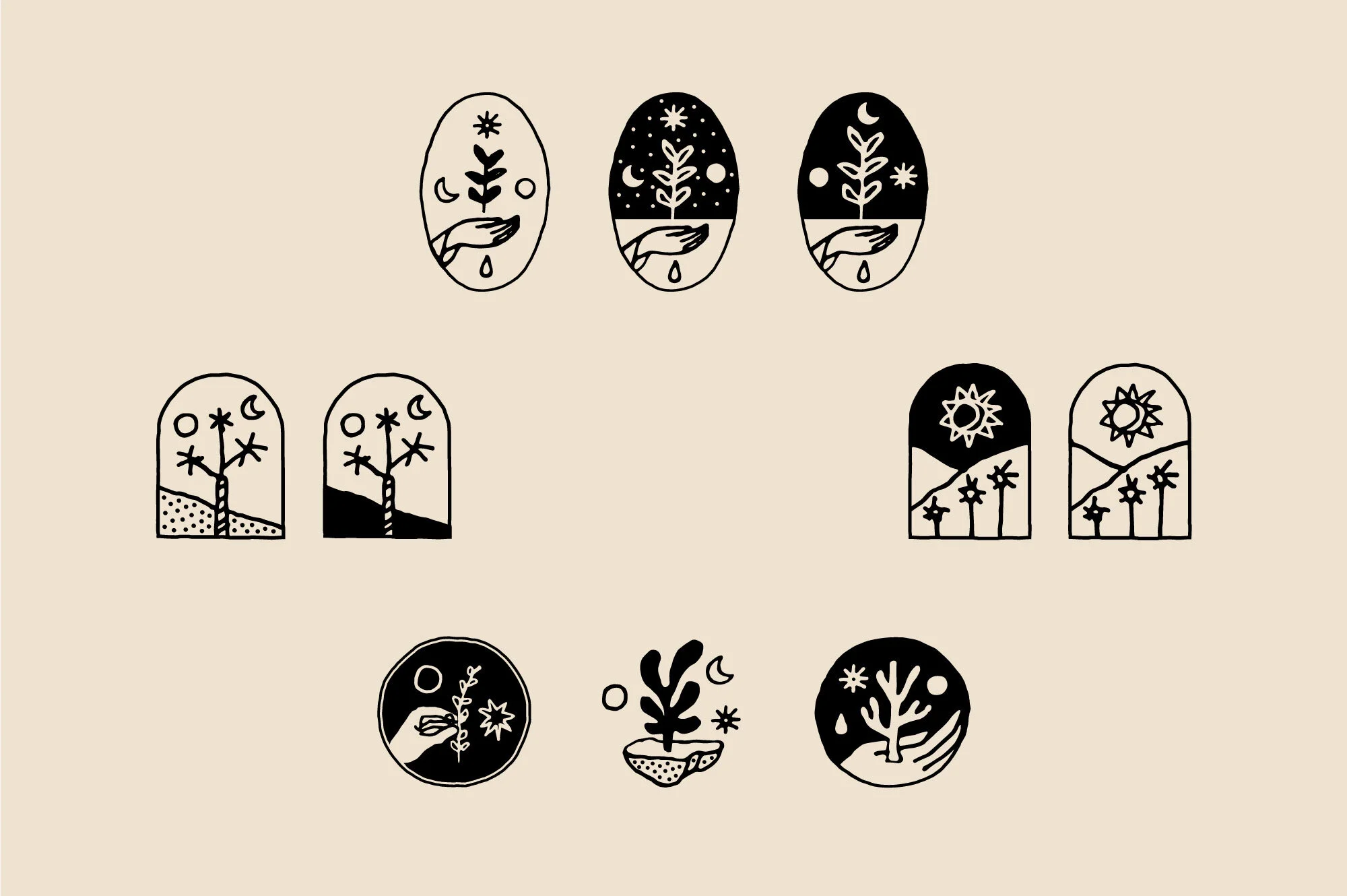
Nature entrusts the earth the incubation of its seeds to hatch a thousand varieties of flavours and colours that we feast on. For this project we drew our inspiration in both the primordial (earth / soil) and the esoteric aspects of agriculture (mythology / alchemy).
Based on these themes, we developed à illustrative symbol representing a woman (Demeter / Ceres) sitting amongst the plants. The palm of her hand is open and collects the sun rays. The sun and the moon represent the crucial influence of the celestial bodies in agronomy (biodynamic approach).
We followed a similar path for the design of the wordmark’s typeface. We developed a geometrical, slabby, thick & thin font with particular ornaments. The combination of these various elements creates classical and refined characters whereas the occasional ornaments adds a mystical flavour to the whole.
Implementations
· Visual Identity
· Website
· Print
· Packaging


